Guide to Responsive Web Design HTML CSS: Build Sites That Look Great on Every Device
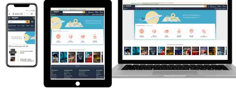
In today’s world, people use phones, tablets, and computers to visit websites. If a site looks bad on a phone, visitors leave fast. This guide to responsive web design HTML CSS helps you fix that. You will learn how to make pages change size and look good on any screen.
Responsive design means your website adapts automatically. It uses simple tools in HTML and CSS. No need for separate sites for phones or desktops. Beginners can start here if you know basic HTML and CSS. We will go step by step with easy examples.
Over 60% of web traffic comes from mobile devices now. Sites that work well on phones keep visitors longer and rank higher on Google.
Why Responsive Design Matters Today
People browse the web on many devices. Phones lead the way. Recent data shows mobile devices make up about 62% of website visits worldwide. That number keeps growing.
A site that does not adjust to small screens frustrates users. They pinch and zoom or just leave. A good responsive design gives a smooth experience everywhere.
Google likes mobile-friendly sites too. It uses mobile-first indexing. That means it checks the phone version first for rankings.
Here are some key reasons to learn responsive design:
- Better user experience: Visitors stay longer and come back.
- Higher conversions: Responsive sites can see 11% more sales or sign-ups.
- One site for all: Easier to manage than multiple versions.
- Future-proof: New devices come out all the time.
This guide to responsive web design HTML CSS focuses on practical ways to build flexible sites.
For more on basics, check this responsive web design tutorial from W3Schools.
Start with the Basics: The Viewport Meta Tag
Every responsive site needs one key line in HTML. It is the HTML viewport meta tag.
Add this in the <head> section:
HTML
<meta name=”viewport” content=”width=device-width, initial-scale=1.0″>
This tells browsers to match the page width to the device’s screen. Without it, phones show the site zoomed out like a desktop.
It is the first step in any mobile-friendly web design.
Try it yourself. Remove the tag and see how the page looks tiny on a phone.
Learn more about viewport optimization in this detailed explanation on MDN Web Docs.
Use Relative Units for Fluid Layouts
Fixed sizes like pixels do not work well for all screens. Use percentages or other flexible units instead.
For example:
- Set the container width to 100% so it fills the screen.
- Use rem or em for fonts that scale.
This creates dynamic website scaling.
A simple example:
CSS
body {
margin: 0;
padding: 0;
}
.container {
width: 90%;
max-width: 1200px;
margin: 0 auto;
}
The container stays narrow on phones but wide on big screens.
This is part of adaptive web design techniques.
Make Images and Media Responsive
Images can break layouts if too big. Use these tips for responsive images and typography in web design and fluid images and flexible media.
Key CSS rule:
CSS
img {
max-width: 100%;
height: auto;
display: block;
}
This makes images shrink to fit but never stretch.
For better control, use the <picture> element in HTML:
HTML
<picture>
<source srcset=”small.jpg” media=”(max-width: 600px)”>
<source srcset=”medium.jpg” media=”(max-width: 1000px)”>
<img src=”large.jpg” alt=”Example image”>
</picture>
It loads the right-sized image for the screen.
This saves data on phones, too.
Guide to Responsive Web Design HTML CSS: Mastering CSS Media Queries
Media queries are the heart of responsive changes. They apply CSS rules based on screen size.
This is a practical examples of CSS media queries for beginners and CSS media queries guide.
Basic syntax:
CSS
@media screen and (max-width: 768px) {
/* Styles for screens 768px and smaller */
.column {
width: 100%;
}
}
Common breakpoints in CSS:
- 480px for small phones
- 768px for tablets
- 1024px for small desktops
- 1200px for large screens
Adopt a mobile-first design. Start with small screen styles. Then add for larger screens with min-width queries.
Example:
CSS
/* Base styles for mobile */
.container {
flex-direction: column;
}
/* For larger screens */
@media (min-width: 768px) {
.container {
flex-direction: row;
}
}
This is the mobile-first approach to front-end web development.
Create Flexible Grid Layouts for All Screen Sizes
Old ways used floats. Now use modern tools.
Using CSS Flexbox for Responsive Layouts
CSS Flexbox responsive is great for one-directional layouts.
Example of a simple navigation:
HTML
<nav class=”flex-nav”>
<a href=”#”>Home</a>
<a href=”#”>About</a>
<a href=”#”>Services</a>
<a href=”#”>Contact</a>
</nav>
CSS:
CSS
.flex-nav {
display: flex;
flex-wrap: wrap;
justify-content: center;
gap: 20px;
}
.flex-nav a {
flex: 1 1 150px;
}
On small screens, items stack. On big ones, they sit side by side.
This helps create flexible grid layouts for all screen sizes and flexible grid system CSS.
CSS Grid for Complex Responsive Layouts
CSS Grid responsive layout shines for two-dimensional grids.
Example card layout:
CSS
.grid-container {
display: grid;
grid-template-columns: repeat(auto-fit, minmax(250px, 1fr));
gap: 20px;
}
.card {
background: #f0f0f0;
padding: 20px;
}
This makes as many columns as fit. Perfect for galleries or blogs.
Combine with media queries for more control.
This is an advanced front-end web development responsive.
Adopt Mobile-First Design
Mobile-first design means build for phones first.
Why?
- Most users start on mobile.
- It forces simple, fast designs.
- Easier to add features for bigger screens.
Steps:
- Write base CSS for small screens.
- Use min-width media queries to enhance.
- Test on real phones often.
This matches UX for mobile web best practices.
Tips for Adaptive Web Design for Multiple Devices
Here are easy tips to make your site great on all devices:
- Use relative units like %, vw, vh, rem.
- Set good breakpoints in CSS where layout breaks.
- Optimize images for speed.
- Make buttons big for touch (at least 44px).
- Test with browser tools or real devices.
- Keep text readable without zoom.
These are tips for adaptive web design for multiple devices and web page responsiveness tricks.
Practical Examples: Build a Simple Responsive Page
Let’s build a full example.
HTML:
HTML
<!DOCTYPE html>
<html lang=”en”>
<head>
<meta charset=”UTF-8″>
<meta name=”viewport” content=”width=device-width, initial-scale=1.0″>
<title>Responsive Example</title>
<link rel=”stylesheet” href=”styles.css”>
</head>
<body>
<header>
<h1>My Responsive Site</h1>
</header>
<main class=”grid-container”>
<section class=”card”>Content 1</section>
<section class=”card”>Content 2</section>
<section class=”card”>Content 3</section>
</main>
</body>
</html>
CSS (styles.css):
CSS
body {
font-family: Arial, sans-serif;
margin: 0;
}
header {
background: #333;
color: white;
text-align: center;
padding: 20px;
}
.grid-container {
display: grid;
grid-template-columns: 1fr;
gap: 20px;
padding: 20px;
}
.card {
background: lightblue;
padding: 20px;
border-radius: 8px;
}
@media (min-width: 600px) {
.grid-container {
grid-template-columns: repeat(2, 1fr);
}
}
@media (min-width: 900px) {
.grid-container {
grid-template-columns: repeat(3, 1fr);
}
}
This page stacks on phones, two columns on tablets, three on desktops.
Try resizing your browser to see it change.
This is a beginner-friendly HTML CSS responsive tutorial in action.
For more advanced ideas, see this comprehensive responsive design guide.
Common Mistakes to Avoid
Beginners often make these errors:
- Forgetting the viewport tag.
- Using fixed widths everywhere.
- Not testing on real devices.
- Loading big images on phones.
- Too many breakpoints – keep it simple.
Fix them early for better cross-device web layout.
Tools to Help You Build and Test
Free tools make it easy:
- Browser dev tools (Chrome, Firefox) – emulate devices.
- Google’s Mobile-Friendly Test.
- Online code editors like CodePen.
These help with screen resolution CSS testing.
How Responsive Design Helps SEO and Speed
Google rewards fast, mobile sites. Responsive helps both.
- A single URL is easy to crawl.
- Lower bounce rates from good UX.
- Faster load with optimized media.
This boosts front-end design patterns for search.
Real-World Examples
Look at big sites:
- News sites stack articles on phones.
- Shops show one product per row on mobile.
- Menus turn into hamburgers on small screens.
They all use these techniques.
FAQs
What is responsive web design?
Responsive web design makes your website look good and work well on any device—like phones, tablets, or computers. It uses flexible layouts, pictures that change size, and smart rules so everything fits nicely without zooming or scrolling sideways. This way, people have a great time visiting your site, no matter what screen they use!
Do I need JavaScript for responsive design?
No, you do not need JavaScript at all for most responsive designs. Pure HTML and CSS are enough—they handle flexible sizes, media queries, and layout changes very well. JavaScript is only used sometimes for extra fancy features, but basic responsive sites work great without it.
How many breakpoints should I use?
Start with 3 to 4 breakpoints—that’s usually enough for most websites. Common ones are for small phones, bigger phones/tablets, laptops, and large desktop screens. Only add more if your design really needs it—too many can make things complicated and slow.
Is Flexbox or Grid better?
Both Flexbox and Grid are great—they just do different jobs really well! Use Flexbox when you want to line up items in a row or column, like menus or cards. Use Grid when you need full-page layouts with rows and columns at the same time—it’s perfect for complex designs.
Conclusion
This guide to responsive web design HTML CSS shows you the main tools: viewport, relative units, media queries, Flexbox, and Grid. Start small. Practice with simple pages. Soon, you will build sites that look great everywhere.
Responsive design is not optional anymore. With mobile traffic over 60%, it helps users, SEO, and your skills.
References
Here are your references rewritten with anchor text (clickable descriptive links):
- Mozilla Developer Network (MDN) guide to Responsive Design – Authoritative explanation of core principles, media queries, and modern CSS techniques (accessed January 2026).
- Kinsta’s Beginner’s Guide to Responsive Web Design – Detailed overview including key statistics, best practices, and practical real-world examples (updated 2024).
- W3Schools tutorial on HTML Responsive Web Design – Easy-to-follow beginner guide with interactive code examples, viewport setup, and media query explanations (accessed January 2026).